The Power of Design
Our owner and founder, Jeremy Picker sat down with Jay Busselle from Equipment Zone to discuss the world of promo today and how it has evolved over the last year. Here’s an expansion on some of the best tidbits.
WHY DESIGN MATTERS
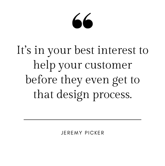
Our team knows Jeremy is passionate about the process of merch curation from design to production and through the screen of a Zoom call, he brought that same passion with him to this conversation as well. Explaining the beginnings of the design process he said, “It’s in your best interest to help your customer before they even get to that design process”.
Design is the first step in making custom branded anything, whether its your logo, your sketch or just a vague idea, design is where every project starts. And as a creative company we are reminded from our passionate “creative geniuses”, and know from seeing hundreds of projects be put out on shelves, design truly is one of the most important selling factors. Picking the garment is of course also essential; you need it fit your audience’s style, age and needs. But design remains the pinnacle of sales, and here's why.
We all can relate to that feeling of seeing a dangling hoodie sleeve, in the most perfect pastel yellow only to pull it from the rack revealing an atrocious graphic reading “LA Leisure & Ratchet Club”. One problem - you aren't Sunday brunching with the girls at the country club gracing the gift shop windows. You are standing in the next fast fashion shop selling gaudy decorated merchandise, disappointed by the amazing pastel yellow that caught your eye.
All to say, that’s why we believe design makes the difference between a disappointing hoodie and a sold out merch launch. It’s our job to be your creative guide from the very beginning of the design process.
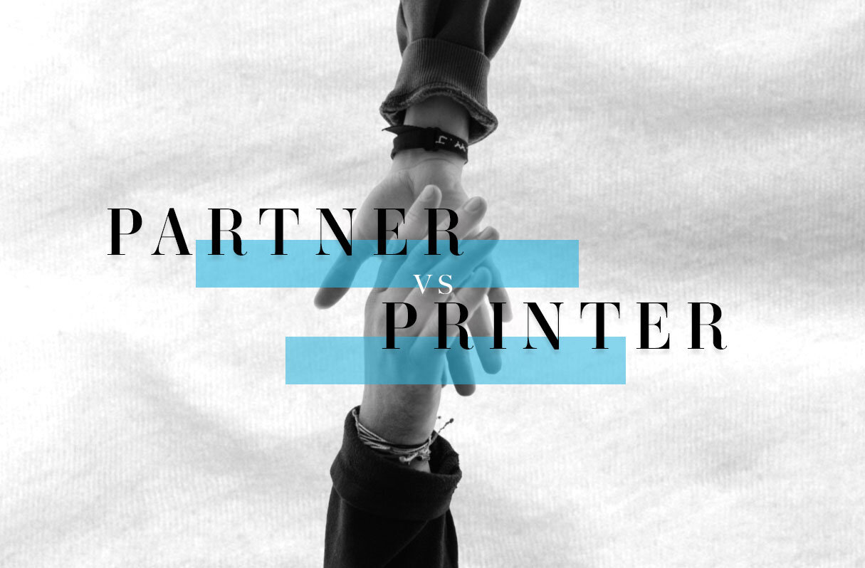
PARTNERS OVER PRINTERS
Jeremy goes on to discuss the company's annual trend report with Jay. We use these reports and Pinterest boards to clarify your vision for a project. Describing style, art and design in words is not the easiest way to communicate creatively, but by having visual guides we can inspire and embody your ideas in the beginning of the merch process.

Howard Moskowitz famously found people don’t know what they want and loved to say, “The mind knows not what the tongue wants." When asked, what do you want in a coffee? Most people would say "I want a dark, rich, hearty roast.". But according to Howard only 25-27% of people actually like a dark, rich, hearty roast. And in reality most people like weak, milky coffee. But no one is going to say, when asked what they like, weak, milky coffee (Gladwell). We think the same may be true for design. Perhaps the mind knows not what will sell in the promo market.
We have a saying that we strive to be partners over printers, meaning we don’t just take your art and slap it on an item (though there are many companies that will). Jeremy said we want to help you before you get to the design process. We are professional artists and graphic designers who don’t want to print the “dark, rich, hearty roast” we want to work alongside you and create the merchandise your fans and customers will love - the “weak, milky” kind of design.
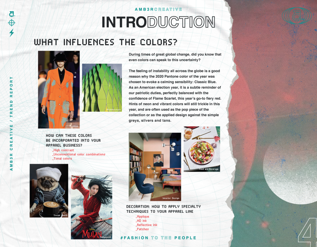
Fall Winter Colors
You know the feeling of spotting swim suits on the racks in February or worse school supplies in July? Well, predicting color palettes in the world of design is the same!
With spring just ahead of us, some brands are already anticipating next fall and winter. While most companies don’t need to plan a year in advance, but starting now for your fall & winter releases will give you plenty of time to design and develop your merchandise.

This dark blue doesn’t culminate feelings of summer, until imagined in the paradise of Greece. This deep color is more representative of a cool crisp sea blue, that is refreshing even in winter.

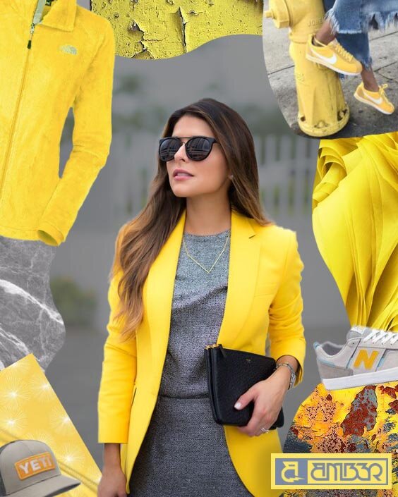
Illuminating yellow is one of this years Pantone Colors of the year for 2021. Representing the light at the end of tunnel as we approach a full year since the pandemic began with much hope as the vaccine is rolling out.

Nearly like a watermelon green, Leprechaun green has an imaginative effect. The name places this green in a fitting Irish setting while also representing the lush side of nature.

Most definitely making for a statement piece, whether in fashion or at home, Fuchsia is a brilliant bold pink. The shade was seen recently on actress Zendaya in a Louis Vuitton advertisement.

As a sweet, gentle pink, Pale Rose is reminiscent of darling baby girl clothes or baby shower parties. But this soft pink has also been seen adding a feminine feel to adult clothing and many home items.

Terra cotta has become popular in just about everything. This orange brown has been all the rage in sheets, bed linens, decor and even fashion. Usually reserved specifically for fall, this shade is sticking around.

Similar in style to Adobe, this Fire Whirl red is reminiscent of earthly dessert landscapes. Adding flare to any style or look this color will bring in warmth and pop to any palette.

Shades like this are commonly know as royal blue for a reason, being thought to represent high achievement. On the second take differentiating it from black, this is really a deep purple blue. While it’s dark there is a calm to this shade.

Softer than Mykonos, Spring Lake blue is a calming mid-tone. Well suited for the winter months this shade is not bright sky blue or radiant ocean blue, but is rather more muted.

Earthy neutral tones have become more and more popular as boho styles in interior design and fashion have been inspired from western or festival-like culture. Browns have been gaining respect since the 90’s according to Pantone, as Starbucks popped up on every corner with cozy, all brown interiors.
What does this mean for your merchandise? Simply - inspiration! Color schemes come and go while a few are staples. You know your customers and we simply hope to inspire some creativity when planning your next project.
Can you own a Pantone Color?
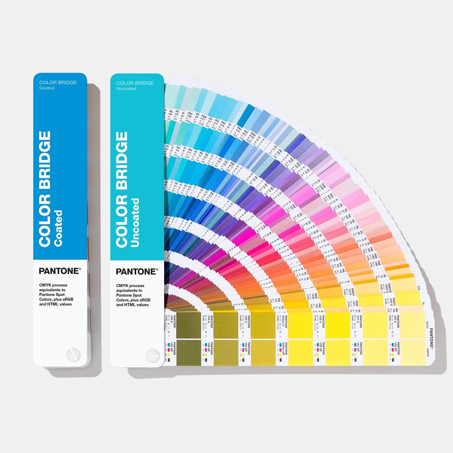
Let’s start where colors are practically born, at Pantone. Founded in 1962, Pantone’s primary product was their Pantone Guides, a small flip book with pages of color swatches laid out in series from light to dark hues of individual colors. This was the beginning of the system used today to help designers and producers speak one consistent language. The Pantone Color Matching System (PMS) has helped standardize color while using the CMYK process for printing on various materials. You may recognize the PMS as Pantone colors are referred to by given numbers and the prefix PMS, “PMS 190”.
It seems there are two ways for you or your company to “have” your own color. Only two individuals have ever purchased their own custom made Pantone color, the first being Jay-Z, the influential hip hop artist, and Sherry Chris, CEO of Better Homes and Garden Realty. Purchasing your own color means making a new color, both Jay-Z and Sherry brought items with them to inspire their vision. Sherry brought a loved pink scarf and Jay-Z a blue piece of his old motorcycle. Both worked closely with Pantone’s trained chemist and technicians for several weeks and paid tens of thousands of dollars to get their custom color just right.

The more common way to ‘have” your own color is through trademark rights. For example Tiffany and Company has not only trademarked their famous robin egg blue, but they also worked with Pantone to find just the right color they were looking for and in the process the color got a custom Pantone number - 1873, the year the company was founded. Several other companies have trademarked a shade they became known for, staking claim to a color. UPS brown, Barbie pink, T-Mobile magenta, and 3M (aka Sticky Note) canary yellow are just a few of the most well known claimed colors.

Like Tiffany and Co., in recent months Clear Pay, an australian lending company, has leaned into the expertise of Pantone. Collaborating with Pantone to build a new visual identity Clear Play created the exclusive mint hue named Bondi Mint in celebration of their Aussie heritage. As custom branding has grown more popular in the digital age, working with Pantone to create new exclusive hues could become a more common practice.

Does this mean no one else can use these trademarked colors? Not entirely. There are complex laws around trademark rights, but the most important distinction is that trademarks are confined to specific industries and products. Meaning you can paint your walls Tiffany blue as long as you don’t market a jewelry company with it!
Promo Industry Predictions for 2021
As 2021 begins there is a sense of optimism even in the chaos. We, like so many businesses, have been adapting to new challenges and obstacles learning along the way. Now the new year is bringing us all a sense of hope that somewhere in these next 12 months we will experience the light at the end of the tunnel!
In the mean time what can we predict for the future of our industry? While business certainly slowed there also came new opportunities. Face masks and other PPE was a new opportunity we were in a position to fill. These products were added to orders and will continue to be products that make people feel safe as events are able to resume later in the year. Custom face masks, hand sanitizers and touch tools will continue to be useful products for the foreseeable future.

As the world dramatically shifted due to the virus, many people are and will continue to work from home. That being said, products tailored to working from home for employees or customers will continue to sell in the coming months. Tech-related products such as bluetooth speakers, wireless chargers, cam-covers or earbuds can be helpful tools in our digital workspaces. Stationary is also a way to bring the office to home in a useful simple way with items like sticky notes, spiral and leather notebooks, pens, pencils, or even a humorous desk name plate.


Likely we are on the back nine of this thing yet experts believe face-to-face interactions won’t be fully normal till 2022. Some of the lifestyle changes of remote learning, working from home, and virtual events will be around for quite some time. Meaning we are predicting cozy apparel will continue to be the most used of our wardrobes, and items that create effective work environments or products that bring us a sense of togetherness are here to stay.
How to Increase Sales by Using Promotional Products in Your Marketing Campaign
Promotional products can be the cherry on top of any marketing campaign. Though you may find this hard to believe. How can a simple product imprinted with your brand name or logo really have that much influence in your campaign? Well, we know from research and what we see large brands doing, that promotional products have the power to increase sales, brand recognition and prompt customers to start thinking about your business.
Generally free items resonate with people, and the best are useful ones. Customers are likely to keep a promotional product if they find it practical and useful. This doesn’t automatically mean these customers come knocking at your door. However if the product they receive is interesting or used for some time, they are likely to remember your brand and the message associated with the item. Delta Marketing reports that for up to, two years customers will remember the item and sentiment, ultimately leading to increased sales.
Now let’s talk about how to choose the right product and incorporate it into your marketing campaign.
YOUR TARGET AUDIENCE:
We stressed the idea that the best promotional products are useful. Yes, useful and relevant to your specific target audience. Think about what your customers or supporters do? What is the demographic? Where do they work? What do they have in common? And then what would be useful or novel to them?
YOUR SPECIFIC MESSAGE:
What are you promoting in the bigger picture? What value are you adding for customers? What is it your customers will gain?
CHOOSING THE PRODUCT:
Once you know who your audience is and have a clear idea for the message you want to deliver, now you need to creatively think of the tangible product to convey this idea in the most useful and unique way.
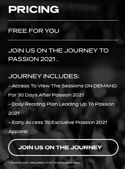
Be specific and original when searching for the best product. For example, let's take a look at what Passion 2021 is doing this year.
Objective: Get more people to register and attend the conference.
Target audience: Young people between the ages of 18-24.
Strategy: Among many other things, they have listed what attendees will gain from the registration on the website just before the registration button. The list includes:
Access To View The Sessions ON DEMAND For 30 Days After Passion 2021,
Daily Reading Plan Leading Up to Passion 2021, and
Early Access To Exclusive Passion 2021 Apparel.
Promotional Product: Again as in previous years they are selling apparel. A simple, but useful choice in product that is probably unique in design.
Here they are not only selling apparel, but have used it as a marketing tool. Their last point uses language that’s enticing and Apparel is the bait. Early Access pulls on a sense of urgency or fear of missing out, Exclusive sparks curiosity and interest, all while Apparel is the pot of gold at the end of the rainbow.
Marketingsherpa describes another unique way a law firm used promotional item in their marketing efforts.
Objective: Generate more business by informing attorneys about the savings the law firm could provide. The firm saved clients an average of about $100,000 per year in fees.
Target audience: Attorneys who file patent applications for US companies in foreign countries.
Strategy: They used a fake $100 bill shaped like a man with a zipper that when opened, revealed a business card with the firm's phone number, contact name, and personalized URL. These were sent in the mail.
Promotional Product: A seemingly simple product, a custom zipper bag with business card, used in a way that was unique and specific to their industry.
Marketingsherpa reports that about 11% of recipients called or visited the URL.
If you are not sure which product would relate to your business or which would be the most unique, reach out to us! We are always discovering new items in the promotional space. We hope these examples inspired ways you could use promotional products in new ways tailoring them to your specific business or industry.
Pantone Reveals Not One but Two Colors of the Year for 2021
Last week Pantone released not one but two color choices for 2021. Pantone’s color of the year always has an existential meaning, reflecting some social or economical dilemma in that current era, and arguably no two colors such as these have ever spoken so clearly to all of us. This year these color choices undoubtedly draw a line to the pendulum of feelings we’ve all experienced this year from tragic gloom to a rising hope.

Photo Credit : Pantone
The first color chosen was Illuminating, the bright, elementary sun, ripe lemon – yellow. While this captures the support and hope we all need, one color could not capture the full picture of our recent times. For only the second time in Pantone’s 22 years, another color was chosen. To complement the tone, our more forefront emotion was brought onto the scene – Ultimate Gray. The gray of imminent rain clouds, wet sidewalks and furry kittens.

Photo Credit : Pantone
Surprisingly, not meant to symbolize gloom, Pantone offers a more thoughtful explanation for the soft gray “It’s a dependable gray,” Ms. Eiseman reports to the New York Times. Proving in fact gray can be more than dreary, like the gray in our grandparents which mirrors wisdom, and the gray of steel that reflects unbreakable strength. The team at Pantone certainly dug deep this year finding ways in which we share the spirit of optimism in these shades.

Photo Credit : Pantone
Alone Illuminating would be overly cheery, insensitive to reality and Ultimate Gray would be dismal and depressing. Together, the pair relays optimism and reliability. They are the light at the end of the tunnel, the sun coming up over dark mountains. This year the demand for a meaningful sentiment was high but Pantone surely delivered.
What does any of this actually have to do with future products of 2021? Well Pantone spends months, if not nearly the entire year, researching and analyzing, interior design, fashion, and consumer trends to predict and influence the poplar colors of the new year. Illuminating and Ultimate Gray will indeed trickle down into the everyday clothing and products in 2021.
Tacos with Jay and Jeff
"Nobody NEEDS another T-shirt, another mug or another hat… so why are they going to buy this branded merch?" asked Jeremy Picker. Because "they WANT to have an experience with that brand."
Jeremy joined Jay and Jeff on FreePromo Tips to discuss how our creative process has evolved over the years and shared more about our current customers. All discussed over tacos of course, Jeremy expresses his love for Torchy’s, though he says prefers his authentic favorites back in Arizona!
As we share our story in these quick 30 minutes, Jeff and Jay provide insight as to how they see us in the larger market of merchandise. For instance, Jeremy shares how early on his vision for the company was to be more style focused than other print shops. Today we create lookbooks and trend reports to share with our customers and as part of keeping our products fashionable. Jeff pointed out that this is indeed unusual for a print shop but makes us an agency rather than just printers.
Jeremy shares much more about how our own business has grown and what it is we really do behind the scenes for customers like you! Click to listen for more.
Holographic Outerwear
Inexplicably we as humans have always been drawn to wear shiny things. Jewelry - yes understandable, but clothing - who thought! As far back as 3000 years ago metallic yarns and threads existed. Gold and silver would be hammered into extremely thin sheets, cut into long thin ribbons and woven into fabrics. Talk about goddess vibes!

Fast forward to today and we have textiles that come in all sorts of shine: metallic, iridescent, reflective, and holographic. This year we are seeing this love for radiance come through in all things outerwear. From high fashion houses to average joe retailers, iridescent puffers, rain coats, and bomber jackets are being seen everywhere in all sorts of colors.

Originating in the 60’s and 70’s the full out rainbow palette is certainly the most eye catching in these modern pieces. The rainbow colored fabrics tend to have the most reflective appearance sometimes creating movement as the colors may actually change as the light and angle change.

On the other hand there are many monotone jackets with a more subtle sheen. Most commonly we are seeing rose gold, purple, white and black as popular colors. With a softer more silk-like shine these monotone puffers and rain coats create a glamorous astronaut look.

These jackets certainly will make the grandest statement of statement pieces in your closet. Our key takeaway is that the holographic look could be making a comeback this season. From the 60’s rainbow shine to muted metallic sheens this winter’s outerwear may have more colorful flair than the typical dark winter coats.
We believe it’s important to watch fashion trends so that we can give you fresh ideas on how you can elevate your current merchandise offerings. Whether your merch is for your staff or retail, we would love to help you integrate looks like these into your current merchandise mix.
Using Pinterest to Increase Customer Engagement

When it comes to social media marketing you’re probably already using Instagram, Facebook, Twitter and maybe LinkedIn. But what about Pinterest? It's a platform that is often overlooked but has been used by some in media marketing for years. You may believe your audience is not on Pinterest or that you simply don’t have time for another social platform. However, if used properly Pinterest can quickly reach a wide audience and generate real leads. Unlike other social platforms an old post can still be seen over and over. A tweet will be history within a couple hours, but with Pinterests smart feed by using keywords your pins will continually appear in related categories.
If you still think you don’t have time to create yet another social page, there is a Google Chrome extension for that! With just a few clicks you can create a pin based upon your already curated product listings. The image, title, description, and link back to your website will preload into a new pin. Maybe add a few more juicy keywords and just like that you can be a part of one of the fastest growing websites in history.

Users on Pinterest will convert into leads and sales more than any other media marketing platform. Pinterest is one giant visual search engine, and people often turn there during the research phase of projects or to find inspiration. Excellent visuals are the absolute key to making it on this platform. Rankings are based first upon popularity, secondly on keywords. If you already have a strong marketing strategy, chances are you have stellar product shots – great. If you don’t, Pinterest certainly is not the only reason for pausing and getting to that first!

Secondly, the keywords. User engagement is outstanding on Pinterest, and each pin will have a link easily leading the user to your products. Keywords are the second greatest tool to get your images in front of potential leads. If your website or product listing is already filled with your relevant keywords that populate into the pin – no problem here. If your link doesn’t have as much verbiage, then be sure to take some extra time to add some in.

Lastly, if you really want to sink your marketing into Pinterest, post any of your other marketing content as well. Make sure your visuals are appealing, use strong keywords and link back to any of your other digital materials such as blogs, videos, or services. Remember Pinterest is one of the fastest growing platforms where content has a much longer digital life. If it’s done right Pinterest can be an extremely engaging marketing tool for your brand.

That was our way to make a strong start on Pinterest. If you are further convinced of its advantages take a look at our page for inspiration of your own brands pins and boards.
From Concept to Print
Like many other companies, as the Pandemic hit the US in mid March we watched most of our business dry up overnight. In an effort to still engage with customers we looked to see what others in the industry were doing. Our findings reminded us why we have always valued design at the forefront of our process – because not many others are doing so. Many other firms that have sufficient funding and loyal clients aren’t putting enough emphasis on design. We don’t believe in making boring logo fitted apparel or fast fashion, we want to create staple, fashion forward, timeless apparel. We will take you through the process of how we start from a concept and go to production in just seven steps.
Concept:
As trends come and go in apparel, the vintage, faded, worn design styles have become our signature look and the one we have the most experience with. Though we aren't stuck in our ways, in recent years we've had an interest in the sporty futuristic looks with bold graphics and message drive designs, and we are always open to the up and coming trends.
Mood Boards:
In order to start bringing the concept to life with visualization we love to use mood boards. We use pinterest to pull from current boards we are constantly adding to. This begins to materialize ideas that will later be simplified in sketching and designing.
![[ AMB3R] Vintage Design Mood Board_ Lores.jpg](https://images.squarespace-cdn.com/content/v1/56b417862b8dde3df5b4ce45/1599079535498-M7J4EZXB03OL57RDEN3X/%5B+AMB3R%5D+Vintage+Design+Mood+Board_+Lores.jpg)
Sketching:
This is when the designer gets the cue to begin. With the mood board in mind we start sketching to allow for a variety of multiple layouts. During the sketching process it’s easier to make changes rather than redesign digital art. Rather than create several options for a client to choose from we try and take the time to design intentionally from the start for the clients needs.
Design:
This is the stage where talent and experience will make a real difference in quality design. Our designer has created thousands of original T-Shirt designs and knows how to incorporate the mood boards and sketches into a seamless process of creating print ready designs.
![[AMB3R] Vintage Design - Round 1 design.jpg](https://images.squarespace-cdn.com/content/v1/56b417862b8dde3df5b4ce45/1599079605692-P7AR22007KXEEW4XQV3C/%5BAMB3R%5D+Vintage+Design+-+Round+1+design.jpg)
Development:
Now is when our knowledge in speciality inks and techniques is vital for producing high quality apparel. For most projects once the design is completed we narrow down which inks to use and make suggestions for which decorations will suit the clients needs.
Testing:
While we have experience with countless projects printing on apparel can be a finicky art. So, we depend on seeing test prints and the ability to make adjustments. Sometimes small changes can make a huge difference when creating retail standard prints. Once we have the perfect artwork the magic of production begins.
Production:
We do well to remember less is more when it comes to production. Utilizing specialty inks and unique techniques can often make for a better T-shirt but isn't always necessary. Production needs to be replicatiable and must be profitable. Remembering this is important throughout the process.
![[AMB3R] Vintage Design - Round 2 design.jpg](https://images.squarespace-cdn.com/content/v1/56b417862b8dde3df5b4ce45/1599079648116-T7EBHVEO1KGK9J70047T/%5BAMB3R%5D+Vintage+Design+-+Round+2+design.jpg)
We want you to think beyond putting just a logo, or plain text on a tee. While this process may be more timely and more costly the benefits will be greater. Customers will notice the difference and see more value in your company when you invest in design. From concept to production be creative and go the extra mile.
This blog was reworked from Jeremy Picker’s guest contribution to Screen Printing Magazine. Read the full article here.
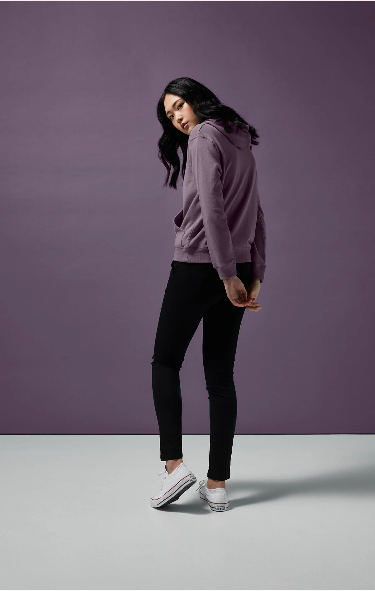
Pretty In Purple
Tie dye and neon, the color popping trends of the past, are getting upstaged by a new color with a similar flare. From pastel to brights, purple is taking over as a statement color of the year. We have seen a handful of color trends come and go but purple has been sticking around proving to have a longer shelf life. Like any true color-trend, the right shade of purple can even be worked as a neutral. Below we’ll show you some of our favorite color pairings and several pieces proving the chic touch of purple seen this year.
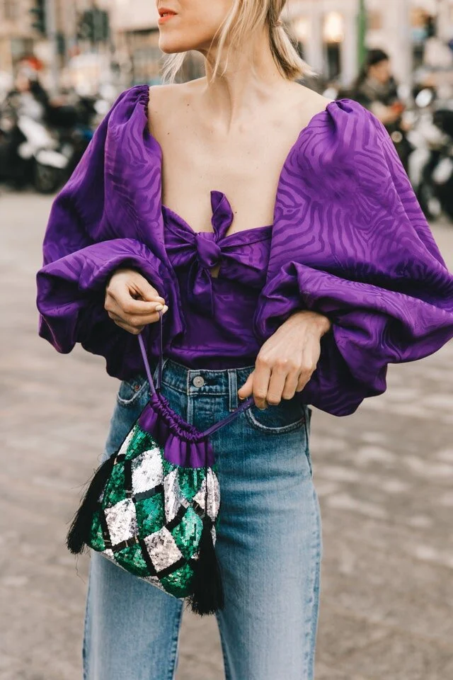
Linda Tol at Milan Fashion Week Fall/Winter 2019-2020
© Diego Anciano
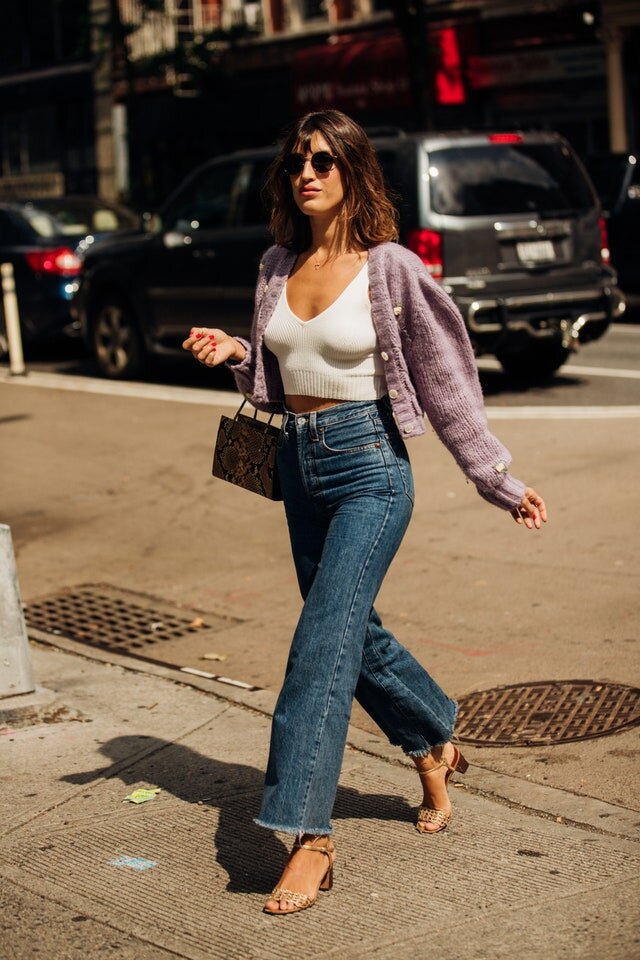
Jeanne Damas at New York Fashion Week Spring/Summer 2020
© Jonathan Daniel Pryce
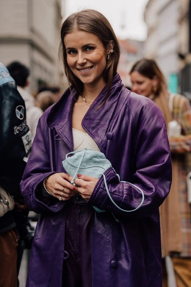
Nina Sandbech at Copenhagen Fashion Week Fall/Winter 2020-2021
© The Locals / Søren Jepsen
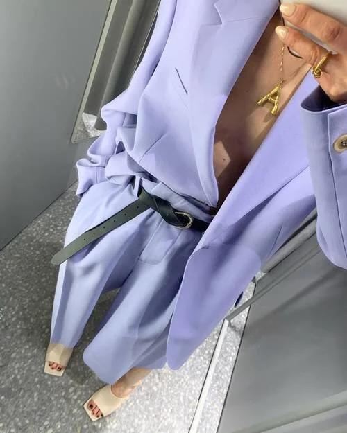
PHOTO: @ANNAABORISOVNA
Part of our passion is looking to fashion trends, so as we received news of this new color release we knew how these pieces fit in the market. We want our customers to be able to get in on the purple glow this season.
We’ve seen this trend styled nearly every way with other bolds colors, monochromatic palates and of course – neutrals. We suggest a monochromatic ensemble with other hues of purple, mauve or lilac. Or we are seeing purple pair exceptionally well with forest or army like green shades.
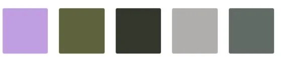
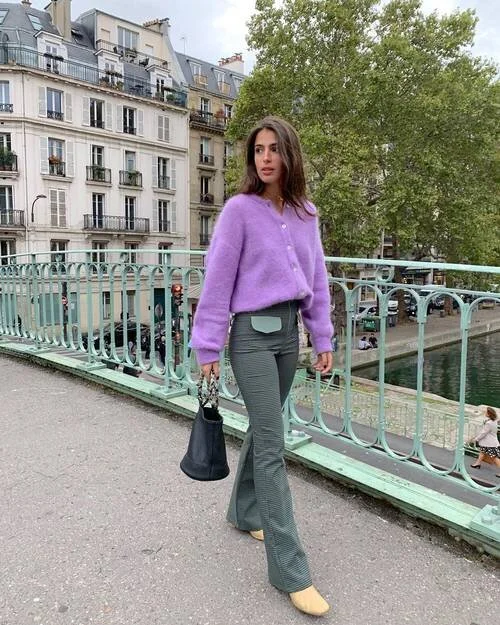
PHOTO: @TAMARAMORY
Face Masks and The Fashion Industry

As the entire country urgently needed face masks, the fashion industry was equipped to help with the main ingredient – fabric. Overtime we now see many major retail brands offering fabric face masks coming in many styles and designs. See below for some of our favorite brands contributing to keeping everyone safe.

Anthropology 3 Pack $24.00

Disney 4 Pack $19.95

Steven Madden $14.95

Old Navy 5 Pack 12.50

Madewell 3 Pack $20.00

Guess $7.00
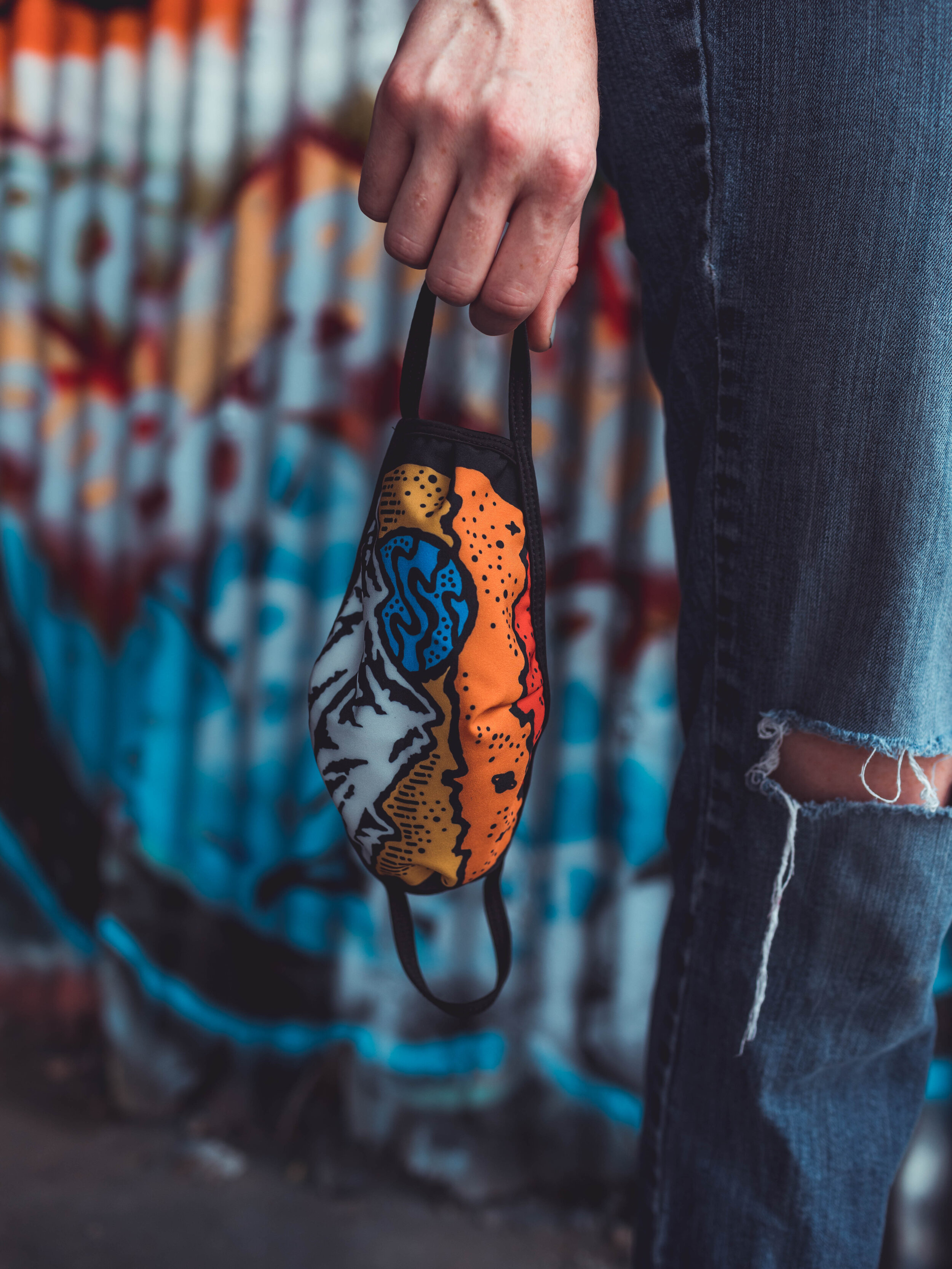
During these unprecedented times we want to also help organizations provide masks to their employees or offer them online to their customers. The process to create custom printed masks is similar to our expertise in apparel printing, making masks an easy transition for us.

Re-Opening Essentials

As states begin to reopen, you may be weighing the decision of opening again; for your customers, employees and entire community. In order to stay safe you will have to make changes in your business, which often doesn’t come easy. We are here to help you choose the essentials you need and brand them with your personal business designs.